©
Date
Oct 2023
Client
Shiseido
Industry
Cosmetics
Timeline
2 Weeks

The Study
Revitalizer sits at the intersection of science and sensorial luxury.
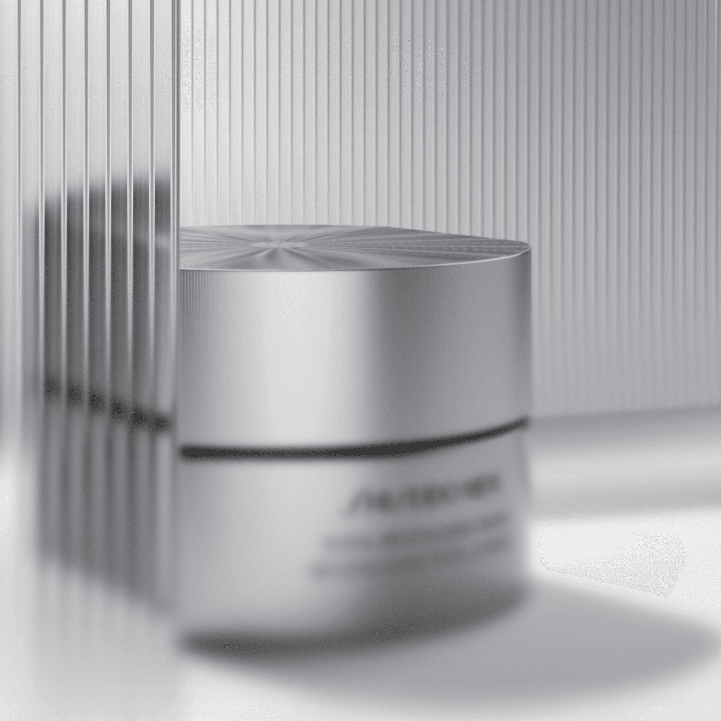
We examined packaging geometry, material translucency, and branding placement to ensure the product retained authority within soft, lifestyle-driven environments. Particular attention was given to how glass, liquid, and metallic accents respond to diffused light, reinforcing a premium skincare narrative.


The Approach
We placed the product within controlled lifestyle compositions using subtle architectural forms and tonal gradients.
Surfaces were designed to complement, not compete with, the packaging silhouette. Lighting was shaped to enhance material richness—soft highlights on glass, gentle reflections on caps, and depth within the product itself—without drifting into cosmetic exaggeration.

The Result
The final renders present Revitalizer as elevated yet approachable.
The product feels grounded in space while maintaining a sense of refinement and calm. The imagery aligns with Shiseido’s brand language: disciplined, modern, and rooted in material and light rather than decorative excess.
Latest projects